Artist in Workshop Residency: Antoine Abi Aad
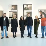
Exhibition “Visual Synonyms”
28.03.2023 -18.04.2023
IUS Art Gallery
Antoine Abi Aad (PhD and MA University of Tsukuba in Japan, DES Académie Libanaise des Beaux-Arts in Lebanon) is an educator, visual communicator, and researcher. He is also a frequent guest lecturer and has held talks and workshops at numerous institutions, including the Universidade de Brasilia (Brazil), International Design School (Jakarta), Institute of Business and Design (Moscow), Hong Kong Design Institute, IIT Bombay, Greenside Design Center College of Design (Johannesburg), Nara University of Education (Japan), Boston University and Yale University (New Haven).
Having participated in 56 exhibitions (31 cities, 19 countries), lectured in 46 universities (21 countries) and taught 2057 students since 2004, Antoine’s true dedication is research and experimentations. His passion is letters: typography, calligraphy and handwriting. The different scripts he writes (Arabic, Latin and Japanese) led him to have special interests in the directions of writing: leftward, rightward, and downward, and how these directions affect visual communication and advertising, or even more, motion graphics and animation.
Antoine was the Chairperson of Typoday Amman 2020, Head of Department of Graphic Design and Visual Communication at the Lebanese University, and he also served as a vice-president of i-cod (formerly Icograda) from 2015 to 2017.
Art Gallery: You are an educator, visual communicator and a researcher, could you tell us more about your practice? Who has had an influential impact on your work? What questions are you trying to answer through your designs?
Antoine Abi Aad: Filtering and guidance. Independent movies, moods stimulated by music (Adoniran Barbosa for one project, Nustrat Fatih Ali Khan for another), inspiration from food (you are what you eat), smell of a fabric, touch of clay or mashed papers, etc. In an era where information is ubiquitous, a class leader’s role is to help students filter information, and teach them to use their time productively. As a designer (teacher, chair, or creator), he/she should help them connect the dots. Béla Bartók, Frank Lloyd Wright, Piet Mondrian or Apple’s logo are from Fibonacci’s sequence, which is present in a strand of their hair, in a starfish, in a galaxy, in a section of a cabbage, in the reproduction of rabbits or in the shape of their ear. From Mandelbrot’s fractal mathematic to Adobe After Effects in motion graphics, things must make sense. An academic dialog is a big help for students to understand the links between all these codes. Moreover, an interdisciplinary dialog and collaboration is my approach in practice as in teaching.
Art Gallery: Can you tell us something about your technique? And, would you please introduce us to your concept of Visual Synonyms?
Antoine Abi Aad: "You are the bows from which your children as living arrows are sent forth."Gebran K. Gebran
The cultural heritage of the Middle East is a treasure that has amazed and inspired artists and designers for centuries, and the future of lettering in this region resides within its rich calligraphic inheritance. Visual Synonyms started in a course at the Lebanese University under the guidance of Professors Antoine Abi Aad and Rana Abou Rjeily. Students studied compositions, forms, rhythms, contrasts, and the rules of harmony existing in traditional Arabic calligraphy, which they used as a springboard to design compositions with modern letters inspired by calligraphic masterpieces, and so create their own visual synonyms. During Covid-19 lockdown, I found myself having free time, something that I had not had for decades, and this is when I started producing my own works with the same exercise I was teaching my students.
Art Gallery: Can you describe your project the Fraternal Letters? What is the story behind it?
Antoine Abi Aad: The natural triangular relation between the Arab world, the Arab language and Islam is obvious to the whole world. Praying in Arabic is a must in Islam. What surprises many people, outside the Arab world is that there are Christians also praying in Arabic, and there are millions of them across the Arab countries. The prayers, Muslim and Christian, have a lot in common, the two religions being monotheistic and Abrahamic. Fraternal Visuals is a transcription of Arabic prayers, Muslim and Christian, which are similar in meaning and in sound. Gathered in one piece, these prayers point at the unity between the two religions, the common roots, and the similar veneration and obedience to the same God.
Art Gallery: You have said that your true passion is letters. Your mother tongue is Arabic, and you studied in Japan. How has Japanese calligraphy influenced your work, especially when creating designs from Arabic letterforms?
Antoine Abi Aad: Bi-scriptual abilities of the Middle Eastern students is an asset that I always focus on. It continually enriches the creative process of designing, mainly in typography, but also in other forms of visual communication. My seven years in Japan added the third (actually the fourth and fifth1) writing system(s) to the first two I write, initiating a unique visual triangular relation that marked my academic research. In fact, my primary formation being in advertising, a design distinguished by its distinctiveness, it affected my way of studying/seeing/practicing visual communication: I always sought originality in typography, an unorthodox conceptual approach. From research to academic experimentations, students I teach could benefit from this unorthodoxy, and together with them I seek to push my former explorations even further: for example, years ago, introducing Japanese typography as a starting point (and inspiration) for students to create Latin, Arabic, Indian (Devanagari, Tamil, Malayalam, Kannada) typefaces, logotypes, and visual identities, the idea for the project “Visual Synonyms” ¸was born from this exercise.
1Japanese language being written in Kanji, Hiragana, and Katakana, three distinct logographic and syllabic characters
Art Gallery: Since you have held workshops on writing directions, can you tell us how you came up with the idea and what it is all about?
Antoine Abi Aad: From Hammurabi’s clay tablets to Jobs’ tablets, writing has never stopped leaving its mark on humankind. While its origins have always been subject of debate, it is undeniable that the development and employment of writing have provoked drastic changes in the history of civilization. Writing, in its various forms of script, made it possible for communities to express danger, facilitate economical counts, spread religions, and express love.
Taking as a starting point the different directions of writing across languages—from left to right, right to left, and top to bottom—the project Directions of Writing seeks to explore the impact of writing forms on broader culture. In doing so, this project covers different aspects of writing (typography, handwriting, calligraphy, graphology on one direction), as well as discusses particularities associated with different languages, including, among others, Arabic letters, Latin, African, Greek, Japanese, Chinese, Hebrew, and Syriac.
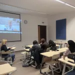
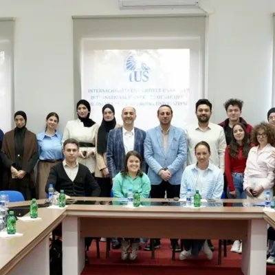
The project at IUS is one of a series of workshops, exploring directions of writing through various aspect; at IUS, palindromes were the theme.
Last but not least, I want to express my gratitude to IUS, particularly Professor Meliha, for her support, friendship, guidance, patience, professionalism, tolerance, to name a few. Many cities are dear to my heart, Sarajevo is one of them now, and that is thanks to Meliha Teparić.


